A statistical map is a map in which the quantity of the information provided is presented. This map shows the percent change in population for the United States (including the District of Columbia and Puerto Rico)
A cartogram is a representation of statistical data in geographical distribution on a map. It is also a map where area is not preserved. This cartogram represents the size of the country based on the number of it's Internet users.
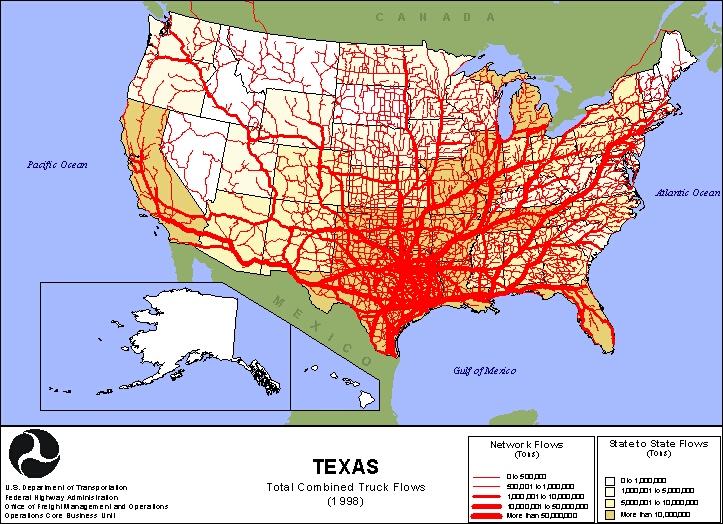
Flow maps are used to show the movement of an object from one location to another. This type of map has the advantage of relaying information to the viewer with reduced clutter. This flow map shows the truck freight flow from the state of Texas, both domestically and internationally.
An isoline is any line on a map joining places where equal values are recorded. An isoline map uses these isolines to give a 2 dimensional interpretation of a 3 dimensional model. This is a weather map grouping areas with the same information together.
Proportional circle maps display data in relation to the size of the circles. This map shows the Filipino population in the Southern portion of the United States.
A dot distribution map shows the presence of a feature by using a dot and displays a spatial pattern. The dot distribution map shows the location of Army and Air National Guard and Army Reserve service members in Ohio.